把居中全实现了一遍,不怕忘记
水平居中
- 行内元素, 父级是块级, 设置 text-align: center;
1 | <div class="container"> |
- 块级元素, 宽度确定, margin: 0 auto;
1 | <div class="container"> |
- 块级元素, 宽度不确定, display: inline-block 或 display: inline 其转换成行内块级, 再套用 1
- 块级元素, 使用 绝对定位 position:absolute, left:50%, 然后 margin-left: -宽度的一半 px; 或者 transform: translateX(-50%)
1 | <div class="container"> |
- flex 布局, 父元素添加属性 display: flex; justify-content: center;
1 | <div class="container"> |
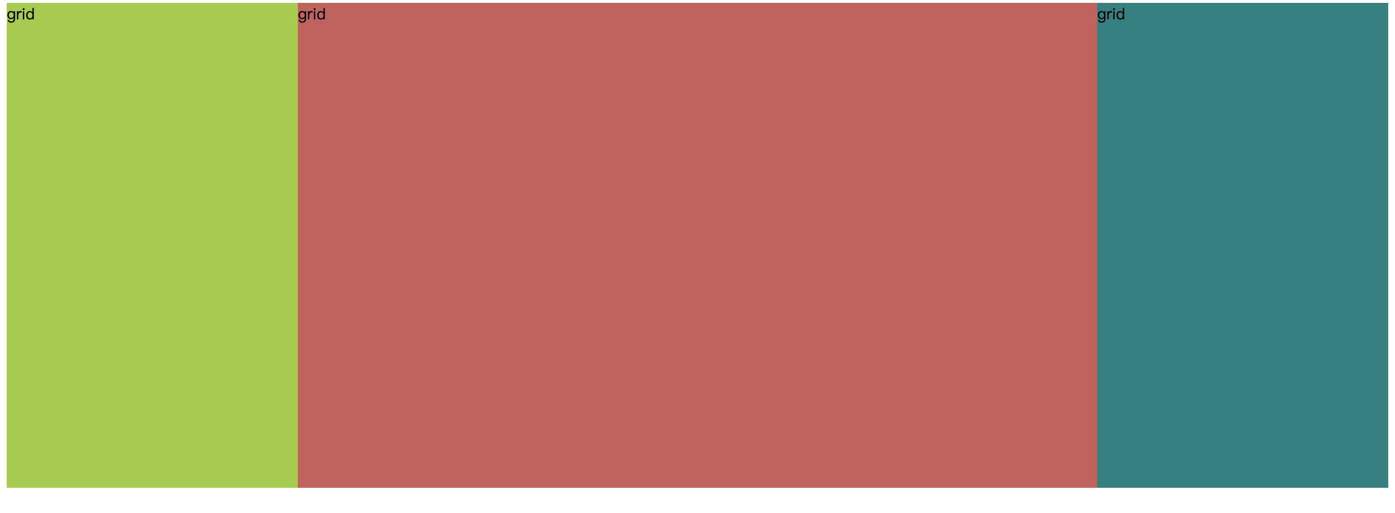
- Grid auto xxxpx auto
垂直居中
- 行高等于盒子的高, line-height === height
1 | <div class="container"> |
- 块级元素, 使用 绝对定位 position:absolute, top:50%, 然后 margin-top: -宽度的一半 px; 或者 transform: translateY(-50%)
- flex 布局, 父元素添加属性 display: flex; align-items: center;
1 | <div class="container"> |
水平垂直居中
- 子元素宽高固定,父元素为非 static,给子元素设置绝对定位,top: 0; right: 0; bottom: 0; left: 0; margin: auto;
1 | <div class="container"> |
- 绝对定位,left: 50%; top: 50%; margin-left: –元素宽度的一半 px; margin-top: –元素高度的一半 px;
- flex 布局, 父元素添加属性 display: flex; justify-content: center;align-items: center;
双飞翼
左右固定, 中间自适应
- 浮动
1 | <div class="container"> |
- 绝对定位, main left 和 right 等值
1 | <div class="container"> |
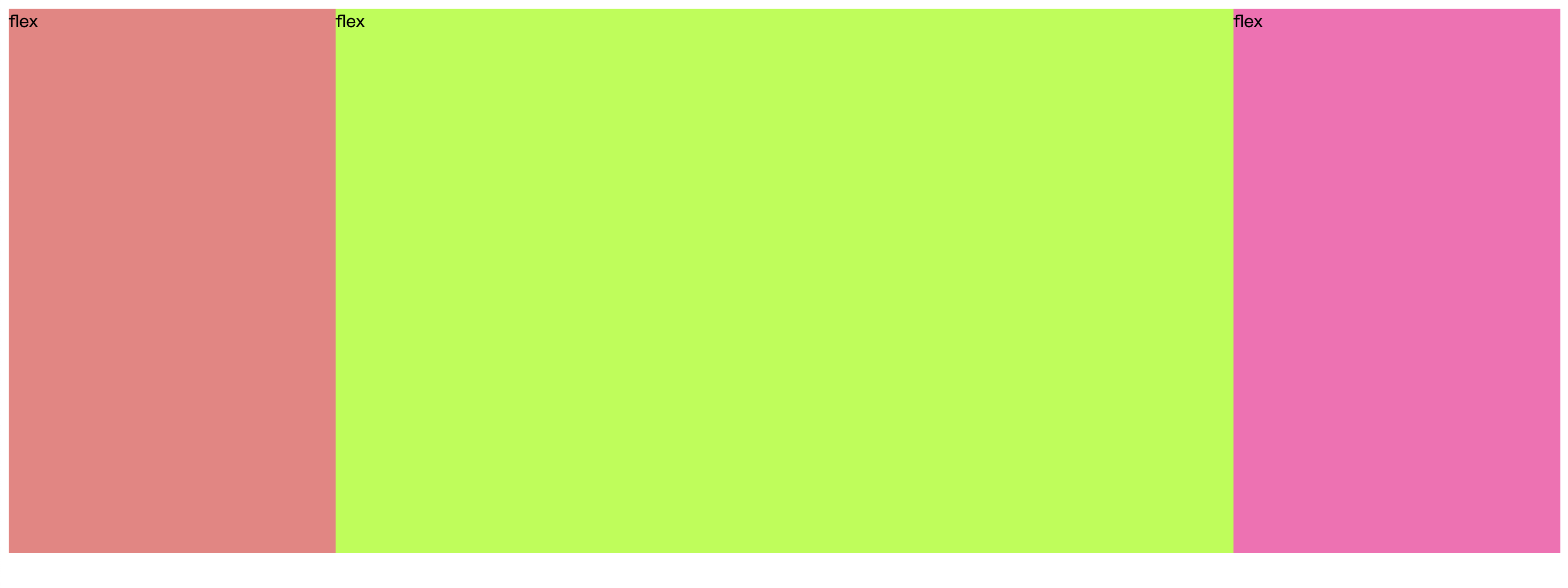
- flex
1 | <div class="container"> |
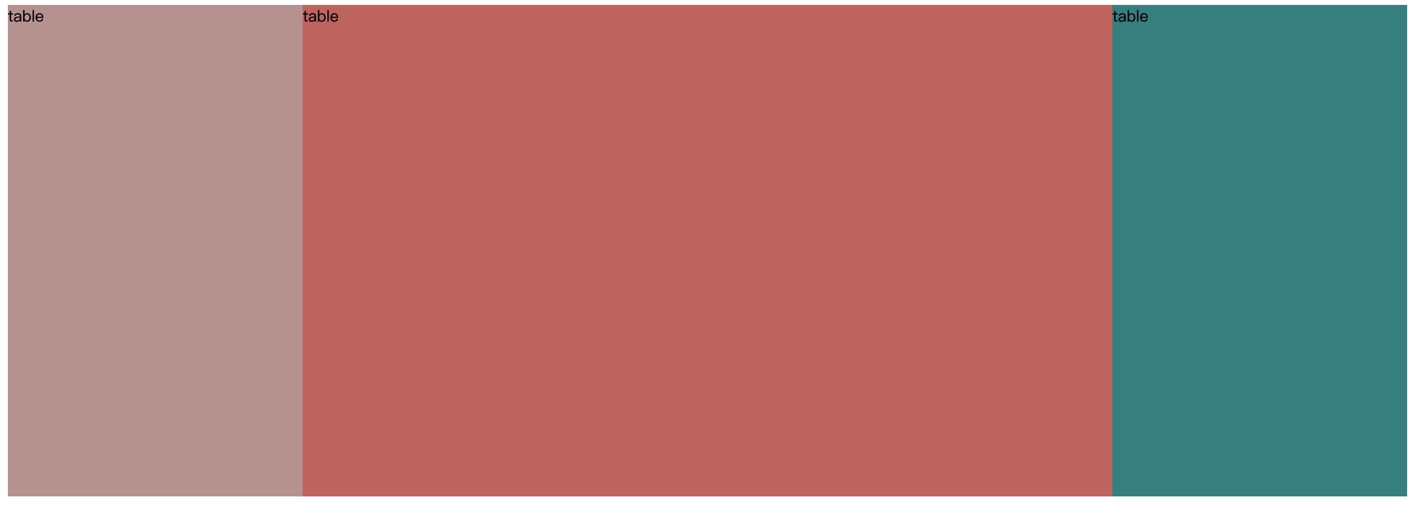
- table。 还别说,邮件客户端浏览器比较垃圾,经常会用到!
1 | <div class="container"> |
- calc()+inline-block
1 | <div class="container"> |

- grid
1 | <div class="container"> |